

Marjolein Opsteegh
Power BI Visualization expert
Power BI visualisatie specialist
Papendrecht, The Netherlands
Actions
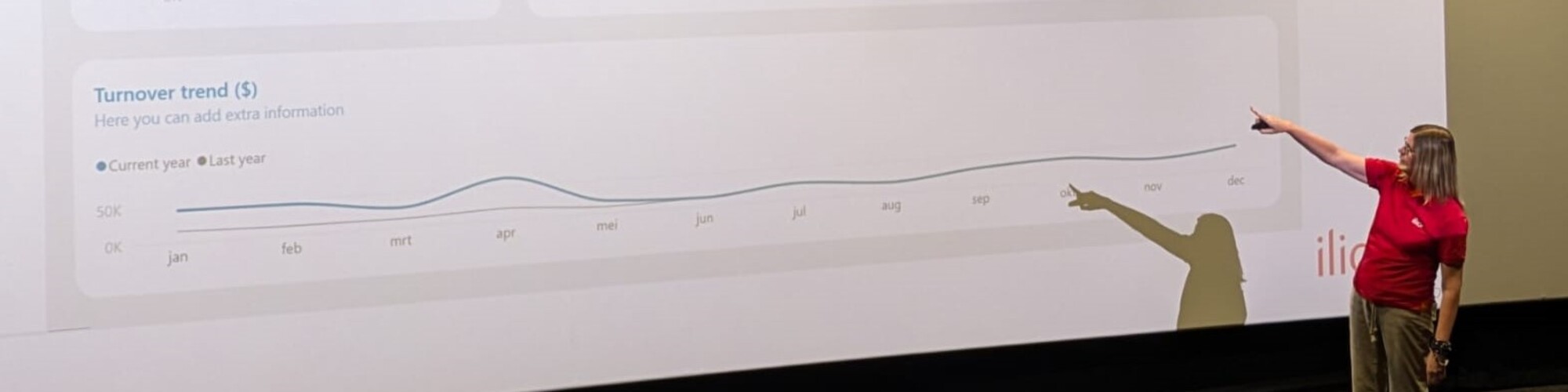
Hi, my name is Marjolein. I'm a Power BI consultant, trainer, and speaker who loves helping people get more value from their data. My passion lies in creating dashboards that combine strong visual design with a great user experience, making data easier to understand and act on.
I regularly share my knowledge through training courses, workshops, presentations, blogs, and videos, both online and in person.
Hi, mijn naam is Marjolein. Ik ben een echte Power BI-enthousiasteling met een passie voor dashboardontwerp, gebruiksvriendelijkheid en datavisualisatie. Als consultant ontwerp en bouw ik dashboards die niet alleen visueel aantrekkelijk zijn, maar ook intuïtief werken voor de eindgebruiker.
Naast mijn werk als consultant ben ik actief als trainer, spreker en contentmaker. Via trainingen, workshops, blogs en video's help ik organisaties en gebruikers om meer waarde uit hun data te halen en betere dashboards te bouwen.
Regelmatig deel ik mijn ervaringen en praktische tips tijdens evenementen, demo's en presentaties, zowel online als op locatie.
Badges


Area of Expertise
Topics
10 tips to build an end-user friendly dashboard
In this session, I will give you 10 tips to build a dashboard "they won't ignore".
Even if you have built such a beautiful dashboard, if your users ignore it, or if the users don’t know what hidden functionalities it contains, it won’t be a success.
During end-user workshops, I‘ve seen huge differences in the speed of adaptation. One clicks around as if he built it himself while the other needs to be taken by the hand and a manual for later.
It is very important to build your dashboard in a structured and predictable way, clutter-free, so the user experience is positive.
In this interactive session, we look at the various options that you have, as a dashboard builder, to make the use of the dashboard easier for all end-users.
This session is intended for dashboard builders and is suitable for all skill levels.
Think about,
✔ The critical importance of alignment in design
✔ How to maintain consistency in color and fonts for a polished look
✔ Effective use of blank buttons for seamless page navigation
✔ Leveraging tooltips to provide user guidance
✔ The significance of adding a homepage to enhance dashboard accessibility
Don't miss out and make sure to take your dashboard projects to the next level!
Mastering Conditional Formatting in Power BI: Tips for Clarity and Impact
In this 20-minute Power BI demo, I’ll show you why conditional formatting is so important in Power BI reports and how to do it the best way.
I’ll show you:
How to use Field Value instead of gradients or rules.
How to write CF color measures to easily change colors.
How to build a CF measure step by step.
How to implement CF in visuals and cards with fx.
This session is all about helping you make conditional formatting work smarter and look better for both your end-users and developers.
Creating Dynamic Power BI Reports with conditional formatting
Power BI’s fx buttons may look small, but they can make a big difference in your reports. In this demo session, I’ll show you how to use these buttons, situated in the Format pane, to make your visuals change based on your data and create reports that stand out.
We’ll go through clear examples, look at key DAX formulas, and explore the Format pane together to see how these tools work in real-life situations. You’ll leave with practical tips and fresh ideas to make your reports both useful and clean.
In this session, you will learn:
o How to use fx buttons to make your reports more dynamic.
o Simple DAX formulas that help you apply fx functionality.
o How fx buttons can change the way your visuals look and feel.
o Tips to create reports that are easy to use and look great.
This session will inspire you to take your Power BI reports to the next level!
6 tips to build an End-User friendly dashboard
Creating a beautiful dashboard is only half the battle, ensuring it’s adopted and loved by your end-users is where the real challenge lies. In this session, based on real-world experience, I’ll share six practical tips that have helped organizations move from ignored dashboards to highly engaged users.
Drawing on insights from countless end-user workshops, I’ve seen the difference thoughtful design can make. One user navigates a dashboard like they built it themselves, while another struggles without guidance. The key? Structure, predictability, and usability.
This session will walk you through actionable strategies, such as:
o Using blank buttons to enable seamless navigation between pages.
o Leveraging tooltips to provide on-demand user assistance.
o Adding a homepage to improve accessibility and user experience.
You’ll see real-world demos that illustrate how small changes in design can make a huge difference for end-users. These tips are tailored for dashboard builders of all skill levels who want to create dashboards that are intuitive, clutter-free, and highly effective in driving engagement.
By attending this session, you will:
o Learn practical techniques to make your dashboards easier for users to navigate and understand.
o Discover how structured, predictable design improves user satisfaction and adoption.
o See real-world examples of dashboards transformed into tools users rely on daily.
o Gain insights you can apply immediately to your own projects.
Join me to take your dashboards to the next level and ensure they deliver value by being loved, not overlooked.
Consistent Power BI reports with templates and themes
Do you find yourself spending a significant amount of time preparing your Power BI report canvas and defining your visual characteristics, repeatedly? Struggling to maintain consistency throughout?
Working neatly, clutter-free, and consistently is important, but it can also give you a lot of headaches.
Did you know it is relatively easy to extract your theme from Power BI and manipulate it to eliminate rework?
Combined with a standard background template, this will save you a lot of time and make consistency much easier.
In this session, we will first take a look at dashboard design best practices and explore the standard functionalities of Power BI. Next, we will briefly examine how to prepare background templates in Figma. Finally, I will guide you through everything you need to know about JSON design themes.
We will cover:
- How to set up a Power BI theme checker file
- How to use the checker
- How to extract and manipulate a JSON file
- How to quickly start a new project.
Furthermore, I will provide a set of background templates, my theme checker, and some JSON files to assist you in implementing what you've learned.
10 tips to build an end-user friendly dashboard
In this session, I will give you 10 tips to build a dashboard "they won't ignore".
Even if you have built such a beautiful dashboard, if your users ignore it, or if the users don’t know what hidden functionalities it contains, it won’t be a success.
During end-user workshops, I‘ve seen huge differences in the speed of adaptation. One clicks around as if he built it himself while the other needs to be taken by the hand and a manual for later.
It is very important to build your dashboard in a structured and predictable way, clutter-free, so the user experience is positive.
In this interactive session, we look at the various options that you have, as a dashboard builder, to make the use of the dashboard easier for all end-users.
This session is intended for dashboard builders and is suitable for all skill levels.
Think about,
✔ The critical importance of alignment in design
✔ How to maintain consistency in color and fonts for a polished look
✔ Effective use of blank buttons for seamless page navigation
✔ Leveraging tooltips to provide user guidance
✔ The significance of adding a homepage to enhance dashboard accessibility
Don't miss out and take your dashboard projects to the next level!
Microsoft Data Platform Meetup Groningen User group Sessionize Event Upcoming
Athens Power BI User Group User group Sessionize Event Upcoming
DataGrillen 2026 Sessionize Event
DataPopkorn - a bite-sized knowledge! (2026) Sessionize Event
Power BI Gebruikersdagen 2026 Sessionize Event
Power BI & Fabric Summit 2026 Sessionize Event
Data Community Day Austria 2026 Sessionize Event
DataPopkorn - a bite-sized knowledge! (2025 - leaf edition) Sessionize Event
DataPopkorn Krunch Sessionize Event
Data Saturday & Fabric Friday Holland 2025 Sessionize Event
Power BI Next Step 2025 Sessionize Event
SQLBits 2025 - General Sessions Sessionize Event
Experts Live Netherlands 2025 Sessionize Event
Microsoft Fabric User Group Denmark - 2024/2025 User group Sessionize Event
DataPopkorn - a bite-sized knowledge! (2025) Sessionize Event
Power BI Gebruikersdag 2025 Sessionize Event
#DataWeekender 7.0 Sessionize Event
Data Community Day Austria 2025 Sessionize Event
DynamicsCon Virtual Sessionize Event
Low Code/ No Code Power Platform Conference Sessionize Event
DataPopkorn - a bite-sized knowledge! Sessionize Event
Data Saturday & Fabric Friday Holland 2024 Sessionize Event
PBIG Avondsessies User group Sessionize Event
Fabric Power BI Portugal 2024 S2 Sessions User group Sessionize Event
Power Platform Learner to Leader User group Sessionize Event
SQLBits 2024 - General Sessions Sessionize Event
Power BI Gebruikersdag 2024 Sessionize Event
Global Power Platform Bootcamp 2024 | Zürich Edition - #GPPBZH Sessionize Event
Data Community Austria Day 2024 Sessionize Event
Budapest BI Forum 2023 Sessionize Event
Please note that Sessionize is not responsible for the accuracy or validity of the data provided by speakers. If you suspect this profile to be fake or spam, please let us know.
Jump to top